America’s Most Beloved Ballpark

For my Final Project I chose Fenway Park.  Fenway Park is the only actively used professional sports venue to be a Nationally Registered Historic Place.  Wrigley field is Chicago, IL is attempting to achieve that same status, but they have not yet been granted it.  Through the 100 years that Fenway Park has been open it has hosted a wide variety of events, but it is mostly known for being home to the Boston Red Sox.

In the first slide I felt that it was important to go over some basic statistics of Fenway Park.  It is one of the oldest ballparks in the country having been built in 1911 and opened in 1912.  At the time that it was built Fenway Park cost approximately $650,000.  For the much money you could buy a house in the suburbs these days!   Adjusted for inflation, Fenway Park would still only cost about $15 million.   To me, that is very impressive for a site with as much history as it does and to have withstood the test of time like Fenway Park has.

The next slide is was important for me to establish some significant years in the Park’s history.  Through my research I was surprised to learn that Fenway Park had caught fire not once, but twice.  Also, that the “Green Monster”, which is the defining feature of the park, was erected after the 2nd fire burned down that part of the stadium.

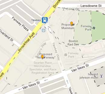
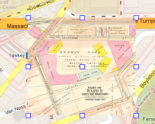
The next thing I did was to overlay a map from 1912 onto a map of current day Fenway Park.  The park has stayed within the same borders that it has always been within.  Even with all of the expansions and construction, all of the surrounding rounds are in place.  I can’t tell if it was the inaccuracy of the map, or if the roads actually did change, but 2 out of the 5 roads around Fenway Park were slightly off in the overlay.  Jersey St (which has since been renamed Yawkey Way) seems to be further way from the stadium and Ipswich St seems to be further away as well.   This could have been something that the city did to expand the streets, or it could have been an improperly scaled map from the early 1900’s.


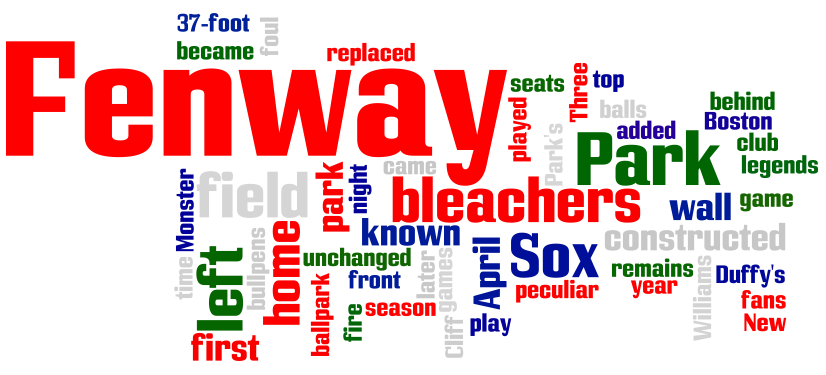
For both of the text analysis components of the final I decided to use Wordle.  I am a huge fan of the tool and believe that it can help you look at something in a different perspective.  The first wordle that I used in the presentation was taken from the “History” section of Fenway Park on www.redsox.com.    I then discussed it on the slide that followed.   I believed that the best way to analyze this was to pull key phrases from the picture and discuss them.   Aside from the obvious, these were the phrases that appeared the most.  “Constructed” “Wall” “Monster” “37-Foot” “Bleachers” “known”.   I think that this reaffirmed that people associate Fenway Park with the Green Monster.   Especially in recent year, they associate it with constant changes and renovations because of the appearance of the word “Constructed”.

Even the greatest of places cannot please everybody, and Fenway Park has some critics.   There are many things about the park that are just out of date.   So in the next slide I tried to transition towards the second part of my topic, which was the problems with the park.   On of Fenway’s greatest criticisms is the fact that it is very difficult for fans to get tickets, because the park is so small and because there is such a high demand for seats tickets are expensive and they are hard to get.   Throughout a large chunk of time Fenway sat just about 35,000 people.   Sometime in the 1940’s renovations to the park and new fire codes caused the owners to remove a certain amount of seats from the park. for a while the park fluctuated within a few hundred seats until the early 2000’s when it rose at a rapid rate because of the $235 million investment made by the owners to update the park.

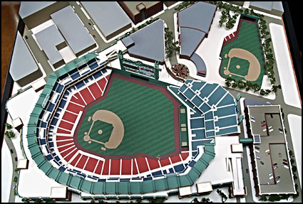
I then moved into discuss “New Fenway” one of the most controversial things to happen involving Fenway park was announced back in 1999.  With an aging stadium and a demand for more tickets, the owners thought that it was time to build something new.   They had multiple options, but the plan that they liked the most was to build a new stadium very close to where the current stadium is and make it an extremely upgraded replica.   They would keep a portion of the old park as a tribute and a museum as well as a children’s  educational center.  Some Red Sox fans sometimes referred to as the “Fenway Faithful” were outraged to say the list.  Groups popped up to help fight again the destruction of the park.  The most prominent of these groups was “Save Fenway Park”.  They would protest, gather petitions and do whatever it took to make sure that Fenway park was not destroyed.  It was arguably the most tradition and character out of any stadium in the United States and out of sheer respect that want to see it stay up forever.   For my next map I decided to create a building outline for the proposed “new fenway” stadium and museum where the old Fenway park was preserved.    I am also going to use the picture that I used as a reference


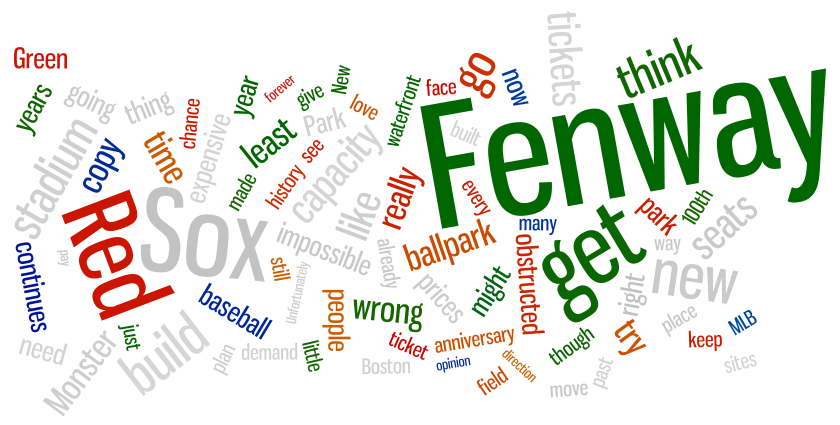
This next part was probably my favorite part of the project.  I researched some articles online such as “No Need for New Fenway” and some message boards that had reactions from Fans. I pulled lines from the article and reactions from the message boards and this helped me to discuss things that fans were actually saying about the new park.

I made a similar decision to pull out the words that I felt explained the wordle the most.  Obviously there are some relative words but when it came to the fans reaction some of the most prevalent words and sayings were “Wrong” “Capacity” “tickets” “copy” “Prices” “New” “obstructed” “think”.   I thought that this was really interesting and because there was so many different voices going into this Wordle (compared to the other one) I got a very different feeling from it.   I think you can tell that there are generally a lot of negative words that appear alot, but they are also some arguments for why a new park was nessacary.  You can see the words obstructed, expensive and capacity which are all negatively associated with the current Fenway park.

For the last graph I decided to compare the size of Fenway Park and “New Fenway” to other major league baseball stadiums.   Fenway park was the 2nd smallest out of all of the stadiums that I listed.  I tried to pull an array of fields, some large, some small, some in the middle to give an equal perspective because it would have been too much to put all 30 stadiums + 1 on there.  Fenway’s “peer park” would have to be Wrigley field seeing as the two are often associated with one another due to their age.  Even Wrigley field is able to sit more fans for every game at Fenway.  Tropicana field in Tampa was the only one listed that was smaller, and it is a much smaller market than Boston.   There is not a demand for Tampa Bay seats, so even with less seats, tickets are easier and cheaper to optain.


All in all I really enjoyed working on this project.  One thing that I was surprised about was the lack of maps I was able to find with layouts of Fenway Park and photos from the early days.  I found it challenging to choose a topic like this, and would probably have chosen something else if I hadn’t already progressed so much in this topic in the given amount of time. The preservation of this project would be similar to www.fenwaypark100.com.  This site was a huge help to me during the project even though I did not actually pull any information about it for the presentation.   I heavily discussed the “new fenway” project and I think that it is easy to preserve that because it was a topic that happened and is not going to change.  According to Red Sox ownership and engineers, Fenway Park has only have 40-50 years left of structural integrity before they can stop playing in the park.   At that time, Im sure that there will be plans for a new park and there will be reference to the last time that a new park was planned.   From the experience that I had, there was very little information online about the new park, so having created a source when there is not very much out there could be of use to people.



Blockly

Monday before class i decided to check out the Blockly website.  The title said that it was a puzzle, and as someone who loves to do puzzles i was very excited.  After 15 minutes my mind was still utterly perplexed by the fact that I only had one command and I could only switch it to forward and backward.  I tried to randomize, I tried both of my limiting options and I finally gave up.  I had been stumped! So I went to class feeling defeat.

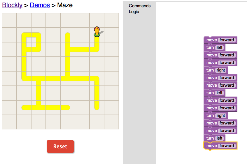
Something must have gone wrong with my mind on monday morning, because as soon as we started to discuss blockly in class I realized that I had missed the command and logic portions.  As professor Cohen was explaining how to use it in class the puzzle-solver in me raced to find the solution before he told the class and ruined the excitement! In a dash I came up with a straight forward and simple solution.  Only use the forward, left and right comamnds

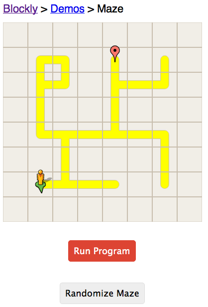
Feeling a slight sense of redemption I tried to get fancy with the logic commands, but I found them somewhat frustrating to use, so to change it up I hit randomize.

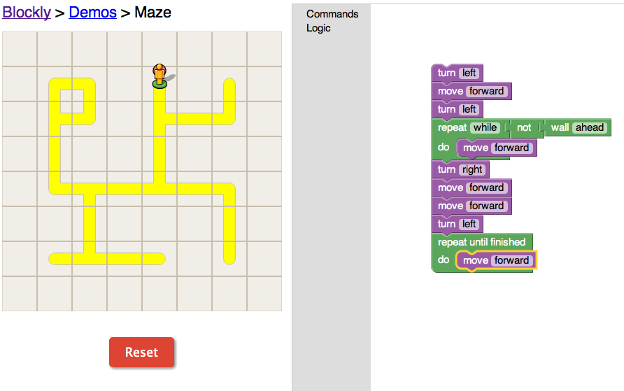
Here was my next challenge


I played around with a lot of different options, but I was just trying to use the command logic.  If I was trying to find the shortest path to the goal point than I could have used some other commands, but I was unable to find much that was useful to me in my goal of finishing as soon as possible.

Overall, I thought that this program was decently fun and it helped me to understand the concept of basic programming.


Everything is Relative….

For this weeks blog post I took a look at the Time Magazine Corpus and the google books NGram viewer.  I found both of these tools really interesting, but there were definitely some pros and cons for each of them.

What I really liked about the Time Magazine Corpus website was the introduction section and all of the options.   This website helped me to understand how the website works because it explains its purpose and certain aspects that a user needed to consider such as how language has changed over time, and allows you to view the data in a few different formats.  You can look at the number disbursement per years, you can see a visual chart and you can compare 2 different words.  Although it does educate users on how to use the website, it is not visually stimulating and it does not make for a user-friendly experience.  I had a lot of fun at first, but the website got boring quickly.  I think that was because of the lack of a visually stimulating show of the results.

When I went on to the Google website I was really pleased with the user-friendly aspects of this site.  It gave you an example that you could work off of with the first post.  It also had a great feature where you could hover your mouse over any specific point on the map and it would give you more statistics for that specific year.  As a test I plugged in a classic question, which is better? or in this case, which appears more Pepsi or Coke?  These are the results that I got

First, I found it highly ironic that Coca-Cola was in blue and Pepsi was red.  Second, I thought that this was interesting results.  It made for a much better and more fun experience than the Time Magazine Corpus site.  I spent a lot more time on this site, just because I was having fun with it.  I tried in a few other great rivalries and got recently interesting results.  Unfortunately when I put it a great debate (Red Sox vs Yankees) there was a significantly higher number of “Yankee” references, but thats because they did not consider the context.  Yankees had a spike around the civil war and because it had a second meaning it had higher results.  I also liked that you could compare as many different words as you wanted to on this website.  I tried Football, Baseball, Soccer and Tennis and the results were interesting.

It was pretty much what I thought the results would look like.  I was somewhat surprised with that soccer was the lowest.  I wonder if it was something to do with the fact that the United States is the only place that it is called “Soccer” and it is not as popular in the US.  As a baseball fan, I was thrilled with these results.

Overall I think that this could give us a really interesting tool to us.  I really enjoyed looking to see where the origination of the sports were.   Tennis has some pretty significant spikes and drops.

Overall I would use the Google website over the Time Magazine Corpus website.  This is because it would be much easier to use and you can adjust the view of the data alot easier.

The Ethics and Legality of “The Archive Team”

After reading through the riveting Powerpoint Presentation from George Mason University’s  copyright officer I was not really surprised by any of the content.  It is not secret that Copyright is a grey area.  While the rules try their best to make it black and white, there are some subject aspects such as the “Fair Use” policy and the fact that it could be used for educational and research purposes pending proper citation.  I understand the purpose of copyright in our society and how it can solve some pretty substantial disputes, but I also find it unnecessary to be used to the extent that it is used.  In some cases, people seem as though they want to sue people because they want to get money out of it.  Money is a huge motivator for a lot of people.  I feel as though some people, especially creative people, are not motivator but monetary factors.  They could be infringing copyright

As for the website ArchiveTeam, I see nothing wrong with it.  I actually found the website really interesting.  I can understand where some people would want to examine the legality and could possibly make an argument for copyright.  I think that the creators of this website are just honestly trying to preserve websites and informer their readers on common practices of larger websites that may effect them.

All of the content that I looked at was credited to the original creators.  The makers of the website would give a brief introduction to the importance of the website, and the reason for archiving it (all of which, is their own personal content) and then it would link to show you examples of the site.

If the website does not exist, what do you care if someone is trying to show off your former work?  I think that websites and companies should be thrilled that there is a website like the ArchiveTeam to keep their hardwork alive.

In terms of the legality, Im sure that there were some long and hard fought court battles around the interpretation of copyright laws, but I believe that the creators of this site made all of the correct ethical decisions.  They give credit to the original creators and are almost honoring their work in a sense.  I think the only ethical breach you could argue is the fact that the website has a very striking resemblance to wikipedia, but it is not alone in that breach.

The Amen Break

I thought that the video “The amen break” was really informative and interesting.  It took something that many of us are familiar with and have heard many times before, but didn’t know the story behind its origination.  If it wasn’t for the fact that this was a very interesting topic, than this video would have been very painful to watch.   I found it difficult to stay intrigued because the narrator was very monotone and used a lot of uncommon words in his speech.
I also believe that this topic is a lot more interesting to someone that is more educated in music terminology and the beats.  I enjoy informative videos like this that also provide visual representations alongside of the song.  One of those examples is a video that explains how the electoral college works.  The video is produced by CGP Grey and is below

What I enjoy better about the electoral college video is the simple addition of pictures and a little bit more excitement in the narrators both.

As the video moves on to talk about copyright laws, I thought that the narrator brought up a great point.  If you asked anyone than they could clearly tell you that The Winston’s were responsible for the creation of that music.  Unfortunately, because it was reused and copyrighted by a corporation there was legal battles for who was the true “owner” of the amen break.  To be completely, that entire section confused the heck out of me and I had to re-listen to it a few times.  Im conflicted on this entire issue because I can see all sides of the story.  I think that the original artists are entitled to the success of the creation, but I also enjoy listening to songs that have sampling in them.  One of my favorite artist is Kanye West, and Kanye is known for how often he uses sampling in his songs.  I think that there should be a way that would give artist access to samples without having to complicate everything.  Of course the original artist should be given a certain amount of credit for the inclusion of their song, but let’s be honest, it is usually a minor part of the song.  If anything, I would take it is a compliment that your music was so good that someone else wanted to use it!

Evaluating Websites

I found this webpage really interesting because it was a lot of rules that I already follow, but I was not completely sure as to why I follow them.  Someone who can get into college can deduce that certain websites are more credible than others.  For example, you can trust something more when you see it on an “.edu” as compared to a random “.com” site that you came across in a google search and doesn’t even have an author.  What I found interesting about this page, and what made me think what the notion of getting to know the website.  Most of us will just take a glance and base our decisions off of what “looks official”.  We need to see where the sources of this websites information are coming from, who is responsible for putting it on the site and why is it there.  For anyone who did not check out this link than I would suggest that you take a look at the website checklist.  For those of you that are students (oh wait, that’s all of us!) this can be really useful in any future research that you have to do.  It is a step by step thorough evaluation of the website and could cause us to take a second look.  Instead of just looking at the website and making a rushed decision this tool allows you to make an informed choice.  I’m sure that you will find a website that you have an initial reaction towards and after using this tool you may (or may not) form a different opinion.  Either way, it cannot hurt you!


Scavenger Hunt!

I was getting frustrated with this assignment at first because I was trying very hard to use some of the boolean techniques that we learned about in class on monday.   I started by using google and searching some phrases with key words.  My first search was “op-ed public school teachers” and I was able to find a few hits, but nothing prior to 1970.  I tried to use the date function, but unfortunately once I narrowed it down to before 1970 there was not any hits.  I then moved over to Jstor and tried some key words there, and sorting it by oldest to newest.  There were some hits prior to 1970, but I was having trouble find an op-ed.  There were a lot of great articles, but they were all scholarly sources.

After spending a good 30 minutes on this process I decided to try to find a specific incident first and then try to find the op-ed from there.  On wikipedia I found a page about a New York City teachers strike back in 1968.  FINALLY, after finding this incident I began to search for Op-eds.  I went to the bottom of the page at wikipedia and began searching for articles on the topic.  I found one of them and then logged on using the ProQuest access from the Mason Library.  TASK 1 COMPLETE

I then started working on Task #2.

Since this task was more ambiguous, I decided to go directly into research.  Since using wikipedia had been really successful before, I returned to that website and looked up Solar Power. I found out the first documented case was in the 1860’s.  What I did next was google search “solar power 1860”  and a lot of the hits were about the development of a solar reflector in the 1860’s by french mathematician August Mouchet.  The link to this document is right here! 

Finally, I embarked on the final task in the scavenger hunt! On cloud nine after a successful 2nd task I had high hopes for task number 3.  That was until I read the question.  This one was much more subjective.  In all honesty the first thing that I did was to call my mom, who is a resident of California and ask her if she knew about anything.  Unfortunately, she is not well versed in the history of California voting.  My first plan was to pull out all of the un-needed words from the prompt.  Since voting data was a necessity I used the “+” boolean operation on it to make sure that was included.  That left me with a search of “resource history of California ballot initiatives +voting data”.  From here, I was really confused because this search is much more ambiguous than the previous two searches.  It allows for the readers opinion.  I spent about 15 minutes searching through results and evaluating different outcomes.  I ended up settling on a resource that I found through the University of California Berkeley’s Law School.

Overall I found this project to be interesting and a little frustrating.  Im sure that it wasn’t meant to be easy, but I was thrown off because of the ambiguity of the 3rd topic.  I enjoy that all three required us to use different search tactics and rules that we had learned about in class on Monday.

Exploring Proquest

This week, I have chosen to right about the experience of exploring the ProQuest historical newspaper, and I had a lot of fun exploring around it.  One of the things that I did was look up some major historical events to see if they differed from paper to paper.

The first historical event that I chose to research was the sinking of the S.S. Titanic.    I first looked to the Boston Globe article, and it was immediately attacking the decision of the captain and crew, which I found interesting.  Immediately after breaking the news one of the headlines read “Men allowed to enter first boats to leave ship”.  The article goes on to say how they should have made sure that all women and children were taken away prior to allowing men off of the boat.   For a comparison I looked up the article on the Los Angeles Times and not only was the article much more woeful, but it was significantly shorter and not published until 8 days after the crash.  It is titled “Commends Discipline of Titanic Crew”.

I specifically chose to compare these two websites because one of them was very close to the crash and the final destination (New York City) and the other was on the opposite side of the country.   While I am sure that all Americans were upset with this incident, I think that it probably had a stronger effect on those that were closer.   It also could come down to the writers of the articles.  I didn’t live in  1912, but I am sure that every newspaper and news outlet had a different voice such as they do in modern day.