Blockly

Monday before class i decided to check out the Blockly website.  The title said that it was a puzzle, and as someone who loves to do puzzles i was very excited.  After 15 minutes my mind was still utterly perplexed by the fact that I only had one command and I could only switch it to forward and backward.  I tried to randomize, I tried both of my limiting options and I finally gave up.  I had been stumped! So I went to class feeling defeat.

Something must have gone wrong with my mind on monday morning, because as soon as we started to discuss blockly in class I realized that I had missed the command and logic portions.  As professor Cohen was explaining how to use it in class the puzzle-solver in me raced to find the solution before he told the class and ruined the excitement! In a dash I came up with a straight forward and simple solution.  Only use the forward, left and right comamnds

Feeling a slight sense of redemption I tried to get fancy with the logic commands, but I found them somewhat frustrating to use, so to change it up I hit randomize.

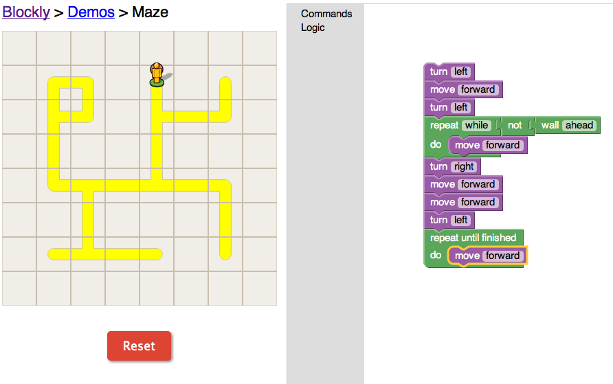
Here was my next challenge


I played around with a lot of different options, but I was just trying to use the command logic.  If I was trying to find the shortest path to the goal point than I could have used some other commands, but I was unable to find much that was useful to me in my goal of finishing as soon as possible.

Overall, I thought that this program was decently fun and it helped me to understand the concept of basic programming.




Everything is Relative….

For this weeks blog post I took a look at the Time Magazine Corpus and the google books NGram viewer.  I found both of these tools really interesting, but there were definitely some pros and cons for each of them.

What I really liked about the Time Magazine Corpus website was the introduction section and all of the options.   This website helped me to understand how the website works because it explains its purpose and certain aspects that a user needed to consider such as how language has changed over time, and allows you to view the data in a few different formats.  You can look at the number disbursement per years, you can see a visual chart and you can compare 2 different words.  Although it does educate users on how to use the website, it is not visually stimulating and it does not make for a user-friendly experience.  I had a lot of fun at first, but the website got boring quickly.  I think that was because of the lack of a visually stimulating show of the results.

When I went on to the Google website I was really pleased with the user-friendly aspects of this site.  It gave you an example that you could work off of with the first post.  It also had a great feature where you could hover your mouse over any specific point on the map and it would give you more statistics for that specific year.  As a test I plugged in a classic question, which is better? or in this case, which appears more Pepsi or Coke?  These are the results that I got

First, I found it highly ironic that Coca-Cola was in blue and Pepsi was red.  Second, I thought that this was interesting results.  It made for a much better and more fun experience than the Time Magazine Corpus site.  I spent a lot more time on this site, just because I was having fun with it.  I tried in a few other great rivalries and got recently interesting results.  Unfortunately when I put it a great debate (Red Sox vs Yankees) there was a significantly higher number of “Yankee” references, but thats because they did not consider the context.  Yankees had a spike around the civil war and because it had a second meaning it had higher results.  I also liked that you could compare as many different words as you wanted to on this website.  I tried Football, Baseball, Soccer and Tennis and the results were interesting.

It was pretty much what I thought the results would look like.  I was somewhat surprised with that soccer was the lowest.  I wonder if it was something to do with the fact that the United States is the only place that it is called “Soccer” and it is not as popular in the US.  As a baseball fan, I was thrilled with these results.

Overall I think that this could give us a really interesting tool to us.  I really enjoyed looking to see where the origination of the sports were.   Tennis has some pretty significant spikes and drops.

Overall I would use the Google website over the Time Magazine Corpus website.  This is because it would be much easier to use and you can adjust the view of the data alot easier.